This week I’ll be covering the CSS property justify-content. I’ve been working on a special personal project this week, and one of the items that I had intended on was a ‘split’ navigation bar with some elements on the left, and others on the right.
I tried just about every property that I could think of, in addition to creating different classes for each of the sets of elements, but nothing was working! 😫 That is until I stumbled across a pair of properties: display and justify-content; specifically display: flex; justify-content: space-between;
For a quick recap of display, per MDN Web Docs:
The display CSS property sets whether an element is treated as a block or inline element and the layout used for its children, such as flow layout, grid or flex.
Using display: flex; allows us to set up an area on our page as a flexbox or a flex container. It is important to use the display property along with justify-content as some of the values for the justify-content property are reliant upon the display type for correct behaviors to occur.
Per MDN Web Docs, justify-content:
The CSS justify-content property defines how the browser distributes space between and around content items along the main-axis of a flex container, and the inline axis of a grid container.
Did anyone else notice the mention of flex container in that above definition? Yes? Good! It ties back into the display: flex; property that we noted above! Now the value for justify-content that we really want to pay attention to for our ‘right-aligned elements in our navbar is ‘space-between’; this value will distribute the child elements of our flex container evenly, with the first element flush with the start, and the last element flush with the end. Let’s see an example:

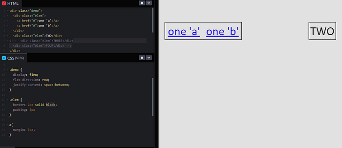
In this example, we used justify-content: space-between; with four child elements of our parent <div>, and it evenly spaced out our elements with ONE being flush to the left side of the flex container and FOUR being flush with the right side. What would happen if we used only two or three elements? Or what about nested ones?

Notice how we can have multiple elements within one <div> and it counts as one element? That is because our flex container helps to define the behavior for our parent element (our first <div class="demo">) and it’s children (the <div class="elem">).
I hope this helps in your quest to ‘align’ some items in your applications!

